

💬 Where this article came from: we raised this topic on Instagram and got 307 comments from Social Media managers asking "but how do I actually interpret this?". Here we expand with every pattern you will come across and what to do in each case.
There is a graph behind every Reel that most creators ignore completely. Not because it is hard to find. It is right there in Instagram Insights. But because, without knowing what to look for, it just looks like a line going down. And a line going down looks like failure. So you close it, post the next one, and hope for the best.
The truth is that graph is the X-ray of your Reel. It shows exactly where your audience stayed, where they started to drop off, and more importantly, why. Creators who learn to read that curve adjust their scripts, sharpen their hooks, fix their CTAs. Creators who do not, keep blaming the algorithm.
What the retention graph is and where to find it
The retention graph, technically called "Plays over time" by Instagram, lives inside the insights of each individual Reel. To access it: open the video, tap the three dots (or "View insights"), scroll down to the performance section, and look for the retention tab.
What you will see is a graph with two axes:
- Horizontal axis (x): the video timeline, from second zero to the end.
- Vertical axis (y): the percentage of the audience still watching at that moment.
By definition, any video starts at 100%. Everyone who clicked is watching at second zero. From there, the line can only go down. What changes is how it goes down.
"Linearity" is the term that describes how smoothly and steadily the line falls, without cliffs. The more linear and the higher it stays, the more value that content delivered to whoever stuck around. Instagram uses that behavior as a quality signal: videos with good retention are more likely to be pushed out to new people.
One important note: the graph counts all plays, including replays. So if someone watched your Reel three times, they show up in all three plays. This means upward spikes on the graph (yes, the line can go up) indicate replays: someone went back to watch a specific section again.
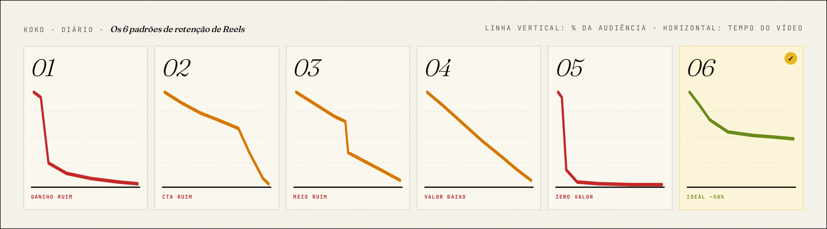
The 6 drop-off patterns and what each one means
The retention graph does not tell you "good" or "bad" in general terms. It shows you exactly where the problem happened. There are six classic patterns, and each has a different diagnosis and fix.
1. Immediate drop (in the first 3 seconds)
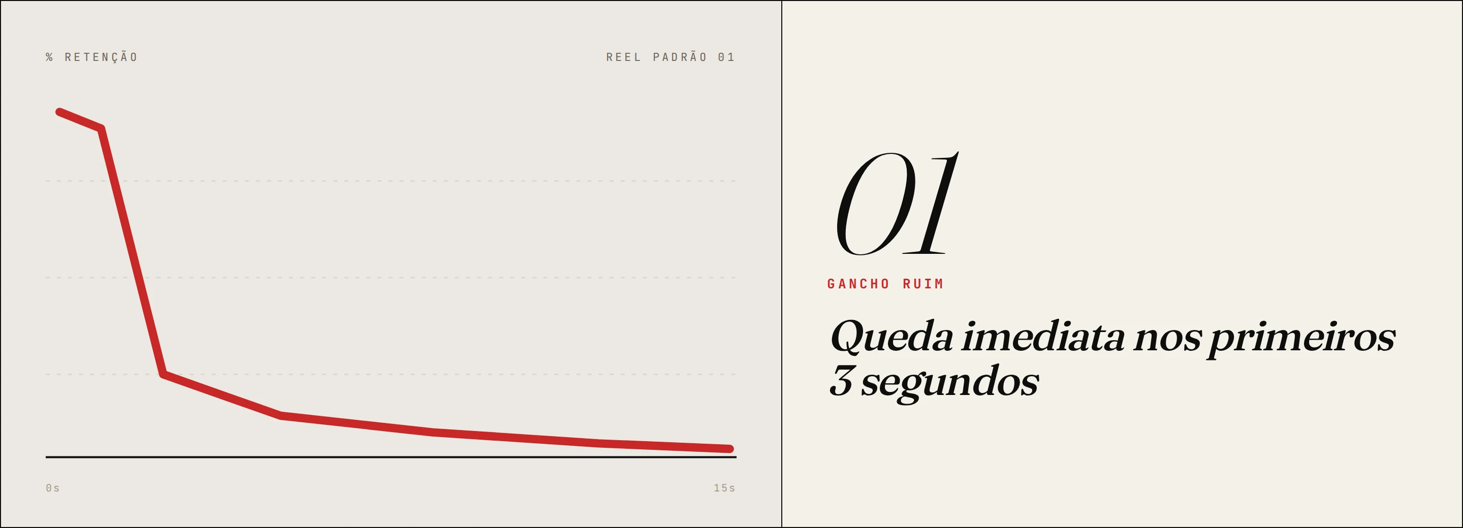
What it looks like: the line plunges almost vertically right at the start, before the video even sets any context.
The diagnosis: your hook is bad. Simple as that. People clicked, saw the intro, and decided it was not worth their time. It could be a generic opener ("today I'm going to talk about..."), weak visuals, slide text that did not spark curiosity, or a pace too slow for someone scrolling the feed on autopilot.
How to fix it:
- Start the video already in the middle of the action, or with a statement that creates tension or curiosity
- Skip introductions, greetings, or unnecessary context in the first 3 seconds
- Test different openings with the same body of content
2. Drop-off at the end of the video
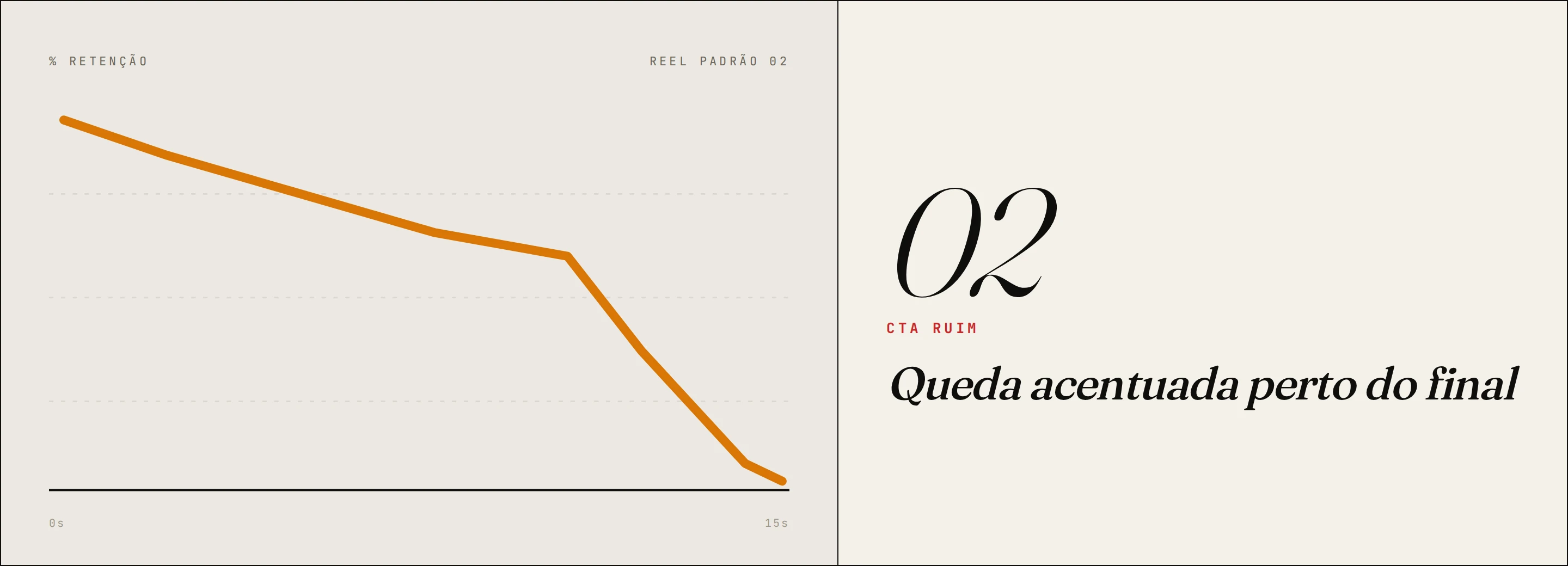
What it looks like: the line holds up well for most of the video, but drops sharply near the end.
The diagnosis: your CTA is bad, or it simply does not exist. People stuck around almost to the end, the content was good, but when it was time to ask for the action, you were not convincing (or you threw in a mechanical "save and share" that no one feels anymore).
How to fix it:
- Frame the CTA as a natural continuation of the content, not an ad tacked onto the end
- Tease the payoff of sticking around in the hook itself ("by the end of this video you'll know X")
- Test specific, contextual CTAs instead of generic ones
3. Sharp drop in the middle
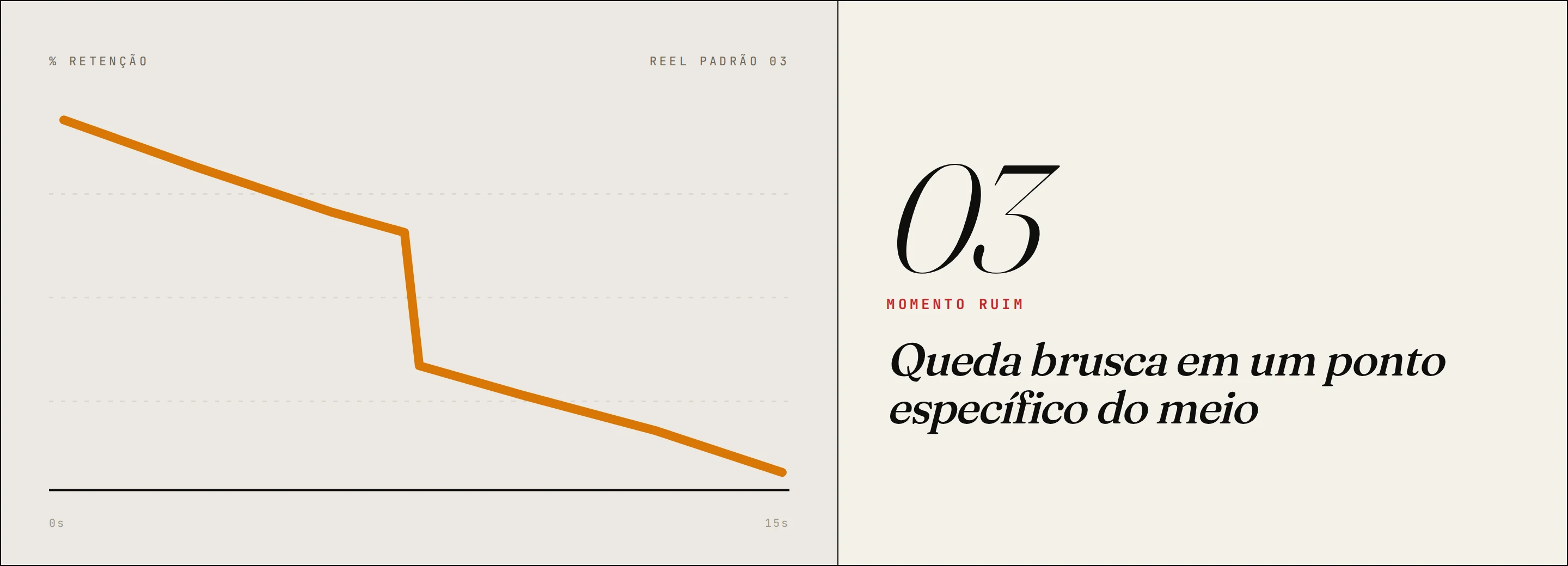
What it looks like: the line starts well, drops abruptly at a specific point in the middle of the video, and sometimes keeps falling after that.
The diagnosis: something went wrong right there. It could be a clunky transition, a long slow stretch, a topic shift without a bridge, an editing mistake, or anything that broke the flow for the audience.
How to fix it:
- Watch the video starting from the exact second where the drop happens
- Identify what changed there: pacing, visuals, audio, content
- On your next productions, plant "internal hooks" throughout the video to keep attention
4. Gradual, steady decline
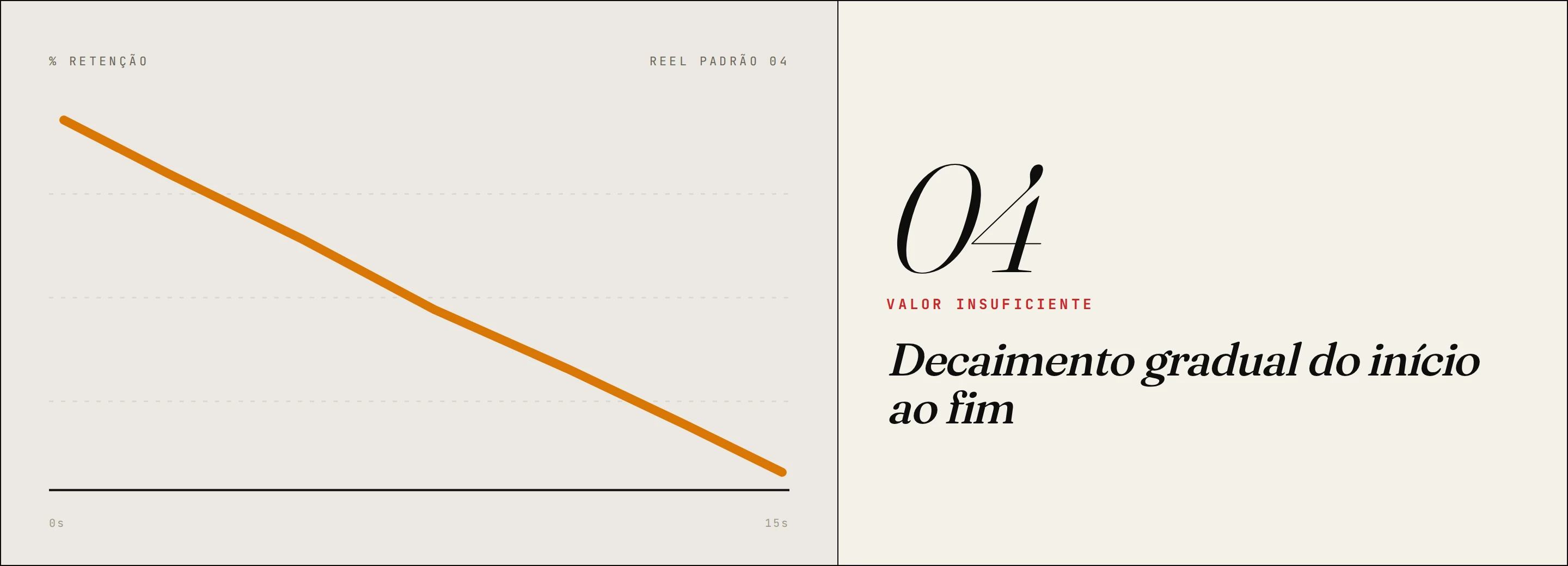
What it looks like: the line starts falling early and keeps falling smoothly and progressively until the end, with no spikes or sharp drops.
The diagnosis: the video does not deliver enough value to justify the time of whoever is watching. There is no single bad moment, the whole content is just average. People drift away bit by bit because nothing hooks them.
How to fix it:
- Revisit the premise of the video: is it actually useful, new, or surprising?
- Add value turns throughout the script, moments that make the viewer think "I didn't know that"
- Cut anything that is filler or repetition
5. Immediate drop with no recovery
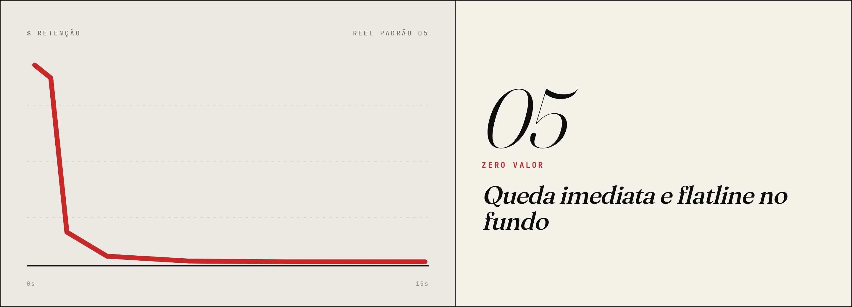
What it looks like: the video loses almost the entire audience in the first few seconds and stays at very low retention for the rest, below 20%, basically a flat line at the bottom of the graph.
The diagnosis: this content did not work at any level. Bad hook, no perceived value, or a complete disconnect between what the thumbnail/title promised and what the video actually delivered.
How to fix it:
- Do not boost this video. Do not try to "save" it with a good caption. Learn and redo it.
- Revisit your value proposition: what are you teaching or showing that no one else is?
- Reread your script before recording. If you would not watch to the end yourself, your audience will not either
6. Initial drop with linearity near 50%
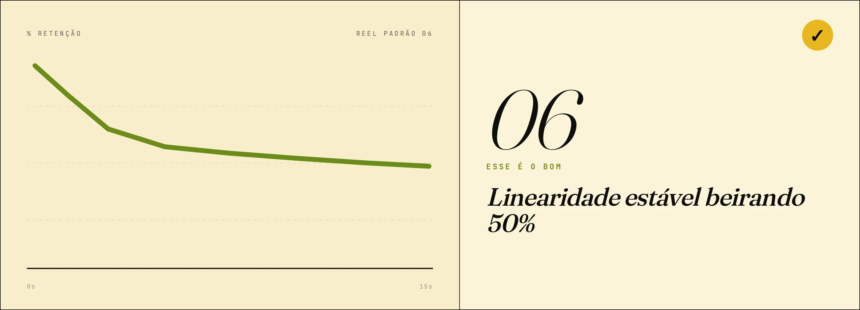
What it looks like: the line falls a bit right at the start (that is normal, the algorithm pushes the video to people who may not be your core audience), but then stabilizes and holds around 50% in a fairly linear way through to the end.
The diagnosis: this is the pattern of a good video. The initial drop is natural and expected. What matters is that whoever stayed, stayed for real. Stable linearity above 40 to 50% is a sign that the content delivered what it promised.
What to do: analyze what worked in that video and replicate the structure, pacing, and hook style in your next ones.
What the retention graph does NOT tell you
Think about this: you produced a Reel with flawless retention. 55% linearity, no sharp drops, an almost perfect line. And at the end, zero leads, zero DMs, zero commercial result.
That happens. And it is important to be honest about it.
The retention graph measures attention, not purchase intent, not qualification interest, not decision-making. An audience can love a pure entertainment video and never buy anything from your brand. High retention means the content was consumed well. It does not mean it converted.
Other things retention does not capture:
- Sentiment: was the comment positive or negative? Retention does not distinguish.
- Audience quality: your video might have held 60% of people who will never be your customers.
- Context of consumption: someone watching Reels at 11pm on the couch behaves differently from someone watching during work hours.
That is why the retention graph is a format diagnostic tool, not a strategy tool. It tells you if the video worked as a video. What you do with that attention, the CTA, the offer, the content journey, is another layer of the game. To understand that layer, it is worth cross-referencing retention data with action metrics: link clicks, profile visits, qualified follower growth, and DMs received during the period. Meta Business Suite consolidates all of this in one dashboard, if you want to go beyond native Instagram.
How to use the retention graph in practice: checklist
It is not enough to know how to read the graph without a process. Here is a straightforward workflow we recommend:
- Open the insights for every Reel you post, no exceptions. A video without analysis is a wasted video.
- Identify the drop pattern. Use the 6 scenarios above as a reference and classify it.
- Pinpoint the exact second of the biggest drop. Watch the video at that point and note what happened.
- Group your last 10 videos by pattern. If most of them drop in the first 3 seconds, your problem is systemic hook issues. If most drop at the end, it is CTA.
- Test one variable at a time. Do not change hook, pacing, and CTA all at once. You will not know what worked.
- Come back to the graph 48 hours after posting. In the early hours, Instagram is still distributing to your closest audience. The graph matures with more view volume.
FAQ
What is a good Reel retention? There is no universal number, because it depends on the niche, the duration, and the audience type. In general, keeping linearity above 40 to 50% is considered solid. Very short videos (under 15 seconds) tend to have naturally higher retention. What matters most is comparing your own videos against each other and spotting a trend of improvement.
Does the retention graph count repeat views? Yes. If someone watched your Reel three times, all three plays show up on the graph. This means upward spikes on the curve, especially at the beginning or in specific sections, indicate replays, which is a strong signal of deep engagement.
Do shorter Reels get better retention? On average, yes. It is mathematically easier to hold someone for 10 seconds than for 60. But high retention on a short video is not necessarily better than solid retention on a long one. Instagram weighs duration when calculating signal value. A 45-second video with 50% linearity can carry more weight than an 8-second one with 80%.
Why does my Reel have high retention but few views? Good retention with low reach usually signals an initial distribution problem, not a quality one. The algorithm may not have given it the first distribution window (which happens when the video does not perform in the first hours with your core audience), or the cover and hook did not convert enough clicks to scale. Good retention is good news: it means the content works. The bottleneck is initial attraction.
How often should I analyze the retention graph? At least once per video, 48h after posting. If you are in active growth mode, review all the videos from the week together each week. That way you see systemic patterns, not just isolated cases.
You do not need luck. You need method.
There is a huge difference between the creator who posts and hopes, and the creator who posts, analyzes, learns, and adjusts. The retention graph is one of the tools that separates the two. But it is just one piece. Underneath, there is a whole method of scripting, hooks, video structure, and data analysis that turns content into predictable results.
If you want to stop being the person waiting for the algorithm to smile on you and become the person who understands the game, our free social media resources were built exactly for that. Frameworks, scripts and audits to help you depend on craft instead of luck.
This is our point of view. Check out the original conversation where this reflection came from: